SWAMPTHING
  • DESIGN
  • PHOTOGRAPHY
  • The Bromide Room
  • Contact

Brands&Logos
FMC

Picture

​Updating an old favourite.
Sometimes you don't need a whole new logo - often a touchup will do.

The web and the advent of cheap colour printing means that many good logos aren't up to the job of being understood in a modern world.
​

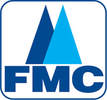
The Old Logo

Picture
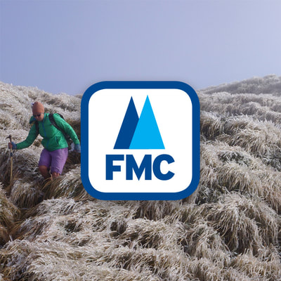
​The Federated Mountain Clubs of New Zealand's old logo, above, had pretty good bones and the membership of the organisation liked it. But it didn't work well on websites, magazines and Facebook. It's thin outline and lack of white space made it hard to see when placed over photos. It looked a bit old fashioned too.

The design of a new logo presented the organisation with a chance to update its whole look and feel. New fonts were chosen and design rules were developed. Publications, websites and office documents have all been updated with the new look.
​

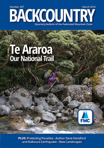
Magazine

Picture
New fonts, a new name and a fresh look for FMC's magazine The Bulletin was undertaken at the same time as the brand refresh.

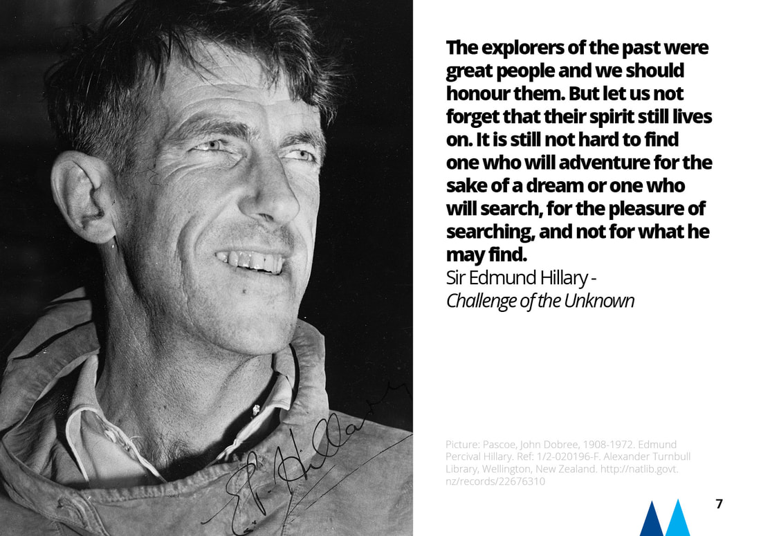
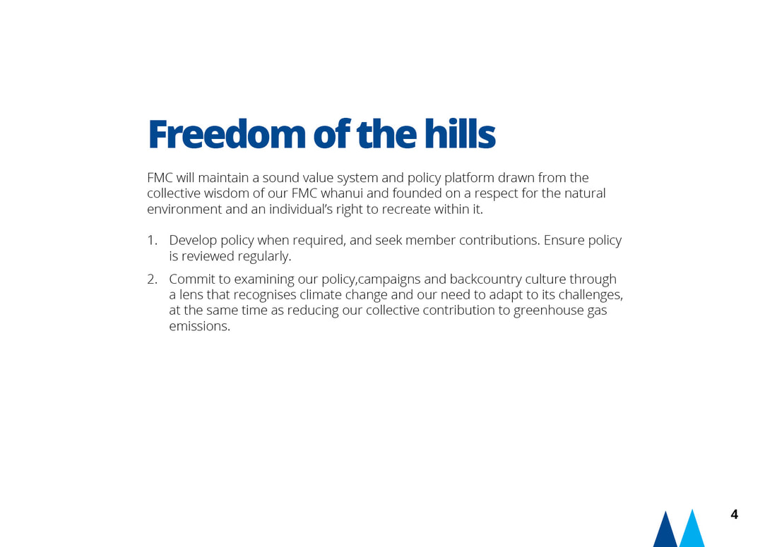
Strategic Plan
​

Picture
Picture
Picture
Picture


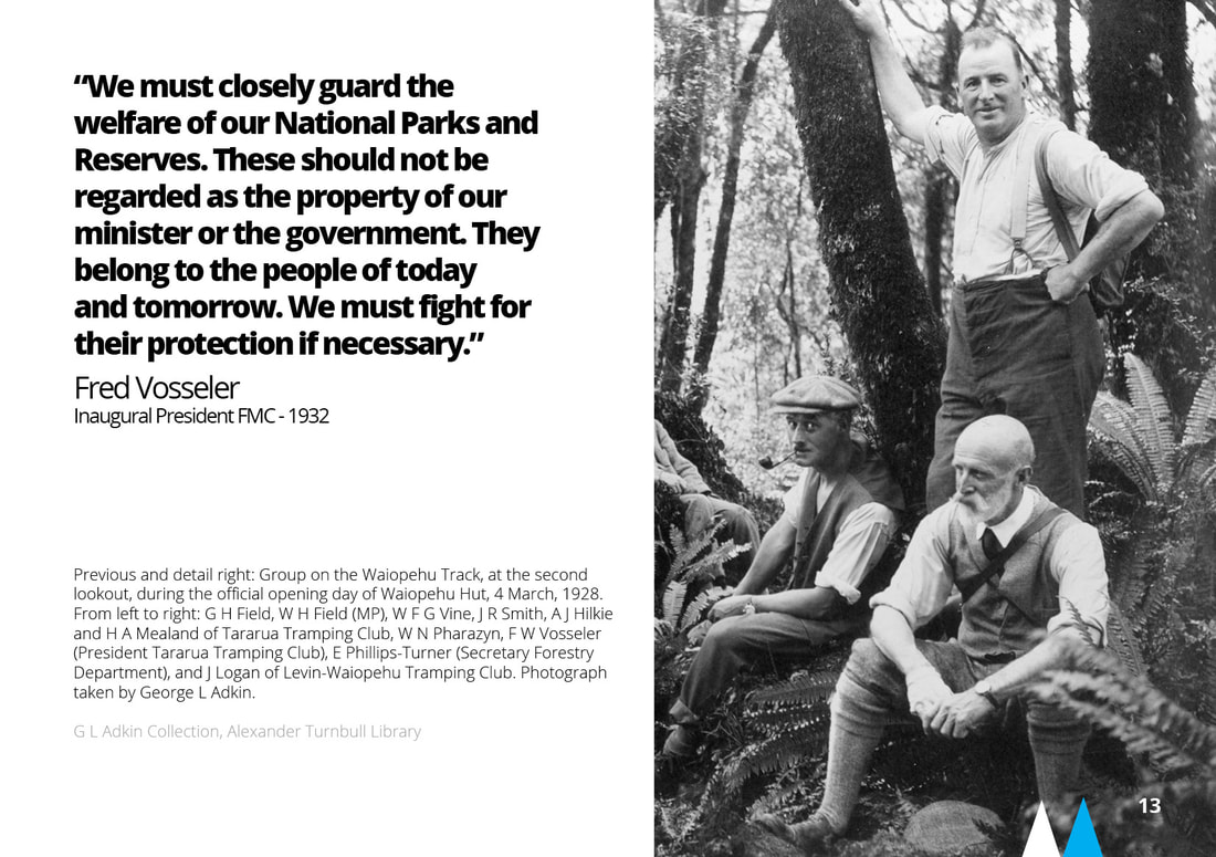
​A5 landscape digital print using new brand elements
​

More BRANDS & LOGOS
​


​BUT WAIT...THERE'S MORE...

HOME

Photography

Blogs

Contact

Picture

PRIVACY POLICY
  • DESIGN
  • PHOTOGRAPHY
  • The Bromide Room
  • Contact