Brands&Logos
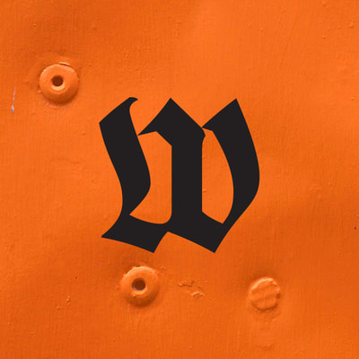
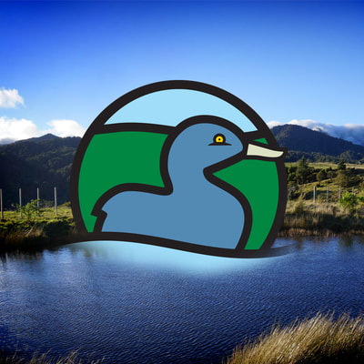
Wilderlife

|
A new brand and for a new media project - a website designed to appeal to a new generation of trampers who like to do things their own way.
|
|
A new brand and for a new media project - a website designed to appeal to a new generation of trampers who like to do things their own way.
|
|
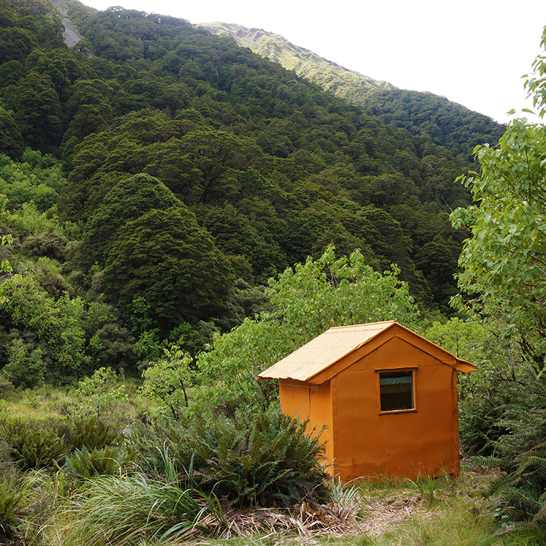
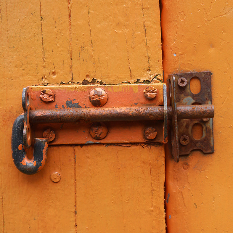
Many of New Zealand's backcountry huts are painted Rescue Orange - a colour designed to stand out in the wild. It's become the colour of our hills
|
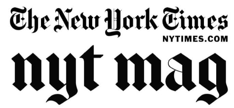
Yes it is. But it's also a very traditional font for media branding.
Wilderlife is designed to stand out, be a little rebellious AND represent a reliable media model. www.wilderlife.nz |